
How To: Implement DR Design Elements in Your Emails
(my own examples included)

Reading time: 01:53 min.
Let me ask you a question –
When you go fishing and the fish just bites the bait…
Do you wait for it to wiggle around and escape?
Or do you pull it out as fast as you can?
The same thing goes for your customers.
When someone shows an intention to purchase...
(e.g. abandons the cart)
You need to close them ON SPOT.
That’s why I recently started implementing some direct response elements in my emails.
No fluff, no messing around, no friction emails.
But before I show them to you, let’s see what an average abandonment email looks like.
(Simply search for “Abandoned Cart” on ReallyGoodEmails)
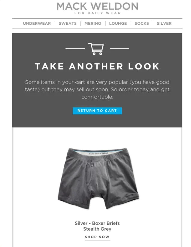
Few things to notice:
Navigation bar with too many options
Generic “take another look” or “you left something behind”
Product feed
Guarantee
Aaand… I used to make exact emails like this.
Shame shame shame.
I know.
But after learning some conversion rate optimization…
I managed to increase revenue per email recipient by 30%.
It’s dead simple and you can probably do it in less time than your ‘generic’ abandonment emails.
(requires minimal design knowledge)
Here’s a step-by-step guide:
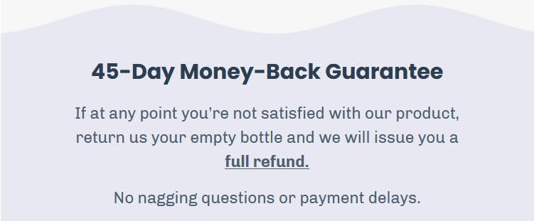
1. Determine your most common objections:
Shipping
Price
Refund/guarantee/warranty
Social proof
2. Reduce everything only to necessary information
Now I do DR copy myself, but if you’re going straight for the kill…
Concise everything together and put it into bullet points and value props.
3. Add *spice* to it
It’s important to guide the reader's eyes.
Simply think what would happen if you installed one of those $99/mo urgency apps to your Shopify store.
What elements would it add?
Color contrasts
GIFs (people opening packages, testimonials)
Flashing 🔥 emojis
9 left
Urgency, FOMO, scarcity
Personalized offer
Free shipping
Simple language (few sentences only)
Now I know many talk about how you shouldn’t include a discount in your first email.
Let’s not lie to ourselves.
You already give away discounts in your ads.
And if you want to finalize that first deal as soon as possible and get customers signed up for your subscription plan…
Don’t hold off!
You’ll make more money down the road if you give them a positive product experience.
Now… element examples I forgot.

And my favorite, the QUANTITY:
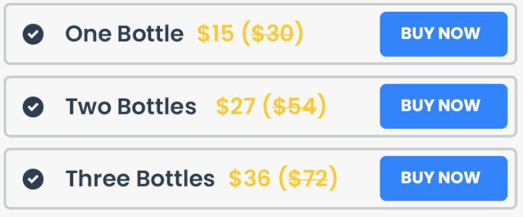
To break it down:
Bright red “free shipping bar” that’s in contrast with the background
Logo
Personalized offer
Product feed
Get XX% OFF
Money back guarantee
If you want to spice it up even more…
Add some GIF testimonials or simply unboxing (can link to a video).
Also, I wanted to mention - remove every other link in the email that's not "Return to cart" or "Unsubscribe.
You simply don't need a navigation bar, Instagram, or Facebook links.
They'll do more harm than good.
Before I close off this email.
Can you notice the lousy DR “design” element in THIS email that got you to read all the way down?
Go back to the top and read the first line.
Drink water,
Beacta